Sachsenring 81-85, 50677 Cologne
Icon legend
![]() This icon indicates an awarded building
This icon indicates an awarded building
![]() This icon indicates a listed building
This icon indicates a listed building
![]() Projects with this logo are on the UNESCO World Cultural Heritage list
Projects with this logo are on the UNESCO World Cultural Heritage list
![]() Project has been converted, renovated or extended
Project has been converted, renovated or extended
x close
![]()
1996
Van den Valentyn - Architektur
Advanced search with more criteria
Total projects: 483

50667 Cologne
Distance: 1.26 km

53111 Bonn

41470 Neuss
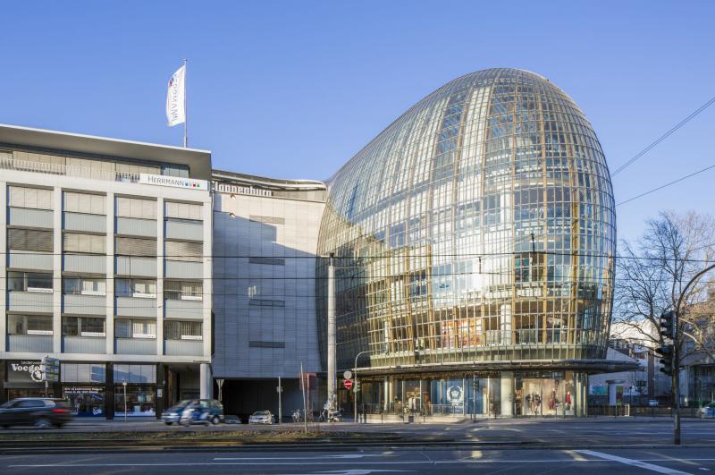
The ensemble is formed by three structures: a transparent double cylinder as an eye-catcher is the “starter”, which, in conjunction with the other structures, presents itself on a flat tray of light granite with flush water basins. Behind it looms the huge glass volume, reaching as far as Lothringer Straße. This block of black granite, standing at a right angle to the Ring, marks the boundary to the adjacent buildings.
If you take a closer look, the double cylinder and the seemingly rectangular glass volume are no such things. After all, they both narrow, one up and one down – and only the massive black block doesn’t join in.
The “self-confident” black block “takes it up“ with the long building by Egon Eiermann in order to form the space for the double cylinder in conjunction with the second large volume, made of glass, and to open up the space on the opposite side of the heterogeneous structure of the Institut Français (Wilhelm Riphan).
The glass-faced cube at its centre has a light and spacious patio sending daylight down as far as the basement with its training rooms and a colourful high-end garage.
In this part, we find the office areas and a large quadrangle. Since the bearing walls are inside the building, not linked to the outer wall, this allows for a slight outward slant of the steel-glass façade and for using it as convection space to save heating and/or cooling energy.
The black-cased office “slab” is the only building with a perforated façade of the classical kind. However, it has flush-mounted square windows with elaborate stainless steel frames.
The dramatic touch of falling, slanting, mutually approaching lines and edges of the complex is supported by the sheer purity of the structures: There simply are no eaves, bases or gutters in the way. The materials are used in a reduced and powerful fashion – with references to the respective neighbour.
Awards:
Kölner Architekturpreis 2000 (kap - KKV, BDA Köln, DWB, AFR), Auszeichnung
Author: Gregor Steiniger (koelnarchitektur) / Editorial baukunst-nrw
Last changed on 26.04.2023
Categories:
Architecture » Commercial Buildings » Offices